Smoke Type in Photoshop in 10 Steps

In this tutorial I will show you how to create a smoke typography effect playing with some brushes and adjustment layers. It's a very easy tutorial and you will be able to do the whole process in 5-10 minutes.
Step 1
Open Photoshop and create a new document, I used 1920x1200 pixels. Then apply a gradient, you could fill it with a gradient or apply a Layer Style. I used the layer style, Gradient Overlay. Use Radial for the Style and #07090a - #202b35 for the colors.

Step 2
Add some text in white then go to Filter>Blur>Motion Blur. Use 90º for the Angle, and 40 pixels for the Distance.

Step 3
Now go to Filter>Distort>Wave. use 3 for the Number of Generators, 10 and 346 for the Wavelength, and 5 and 35 for the Amplitude.

Step 4
Go to Filter>Blur>Gaussian Blur. Use 10 pixels for the Radius. Then group the layer and rename the folder's Blend Mode to Color Dodge. You will get a nice light effect.

Step 5
Create a new layer on top of the others and go to Filter>Render>Clouds, make sure you had black and white for the background and foreground colors, then change the Blend Mode to Color Dodge and go to Layer>Layer Mask>Reveal All. With a very soft brush, 0% hardness and black color, hide some areas of the clouds layer. Use the image below for reference.

Step 6
Create a new Folder on the Layers' Palette. Change the folder's Blend Mode to Color Dodge and add a new layer in it. Then use the Smoke Brushes from Qbrushes . Select white for the color and paint over some letters. If you think the brush is not very bright, just click twice.

Step 7
Paint a few more smokes like the image below.

Step 8
Create a new layer beneath the other layers but in front of the Background layer. Fill this layer with black and go to Filter>Texture>Texturizer. Use 100% for the Scaling and 4 for the Relief. For the Texture use Canvas and Light use Top. That will add a nice texture to the image but you will need to change the opacity to 10%.

Step 9
This is a nice new feature in the new Photoshop CS4, actually there's nothing new just the Adjustments palette, but it's very useful because you can edit all the image adjustments like Levels, Hue & Saturation, Curves in that palette. However it just adds a Adjustment Layer, that could be done in the previous versions too.
Anyway, on top of the other layers just add the Invert adjustment. You can go to Layer>New Adjustment Layer>Invert. It will be the same. You will get a very nice effect, like burning paper.

Conclusion
One of the best things in Photoshop is the Brushes Engine and all the things we can create with brushes. With so many excellent sites with Brushes like Brusheezy, Tutorial9, QBrushes, DeviantArt, and PSDTUTS we can find practically all sorts of effects and elements ready to be used in our designs. That means we can focus on ideas rather than figure out ways to recreate things. Also we have 2 very different effects with just one adjustment layer, the Invert. Once again, it's all about playing. I hope you enjoyed this quick tutorial, and let me know if you have any questions.
Click here to download the Photoshop File used in this tutorial.
Step 1 – Choosing a Background
For the best results with this effect, you’ll want to use a dark background. The background should have a hint of color, and should avoid from being too dark (such as pure black). Being inspired from Drasik’s work, I’ll use a dark violet (#120612).
Just to get this out of the way, as you may notice throughout this tutorial, there are LOTS of different ways to go about accomplishing this effect – this is just the way I found to be most convenient.
Step 2 – Setting the Type
We’ll be setting the type in a not-so-traditional way, which will allow us to get a special layering.
Using the Type Tool, type whatever it is you’d like to apply the effect to, BUT only type one letter per layer. That is, you need to type a letter, apply the text, then create a new type layer with your next letter. When all is said and done, you should have a separate layer for each letter.
You’re image probably looks something like this (Quick Note: Type used below is Century Gothic):

Well, that leaves something to be left desired.
Rather than wasting too much time trying to get things aligned perfectly, let’s handle it all in a quick step. Select the Move Tool. Create a selection around the first letter (Ctrl + Click the Layer Thumbnail in the Layers Palette). Next, Select ALL of the Type Layers (Click the Bottom Type Layers name, hold shift, then click the top Type Layers name). Now, in the Options bar, Click “Align Bottom Edges” – the icon that looks like this 

Deselect everything (Ctrl + D), and now start moving your individual letters so that they slightly overlap one another.

Step 3 – Add a Gradient
Create a new Layer above your type layers. Using the Gradient Tool, and a White to Transparent gradient, fill in the work area so that the Gradient is not TOO OPAQUE, or TOO TRANSPARENT where it overlaps with the text, but fades nicely in that area. The gradient should move from top to bottom – Top being the most opaque (Hold Shift to make a perfectly straight gradient).

Step 4 – Cutting out Letters
Imagine that we’re making shaped-cookies. It’s a stretch, but stay with me. In a way, this gradient will serve as our ‘dough’, while the letters will be our ‘cookie cutters’. Those individual type layers created earlier are tools we can use to create shapes from the gradient.
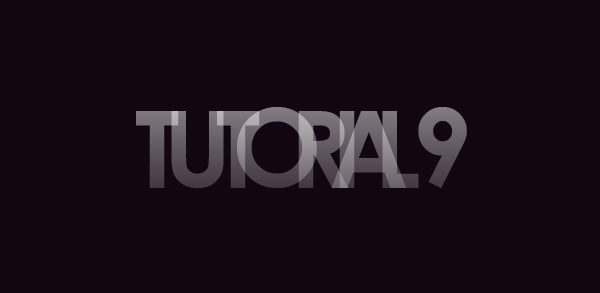
Let’s go through it step by step and see if it makes more sense. Create a selection of the layer contents for your first letter (Ctrl + Click the Layer Thumbnail in the Layers Palette). Now, Select the Gradient Layer (By “Select”, I mean click the layer – do not select the layer contents. We want the selection of the first letter to remain). Copy (Ctrl + C) and Paste so that you’ve created a copy of the gradient in the shape of the letter. If you were to disable ALL of the layers except for this new layer you just created, and the background, you’d now have this:

It’s really a lot simpler than it sounds. Repeat this process for the rest of the letters, always making sure to selecting the gradient layer (the dough) prior to cutting out your layer. When you’re finished, put away all your letters and gradient layers (delete them, or hide them).
Step 5 – Just Add Color!
You may want to name all of your individual layers, that way you don’t lose track of which letter is which, but perhaps you’ve got a manageable number and that’s not necessary.
Create a new layer above all your ‘gradient-letters’. Grab the Paint Bucket Tool, and a bright color (I’m starting with #7fff5d). Create a selection of your first gradient-letter (Ignore any messages you may or may not see about no selection being shown), and fill in that selection with your selected color on the new layer. Set this layers Blending Mode to Screen.
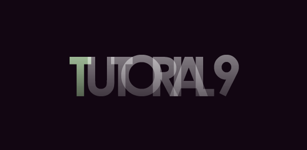
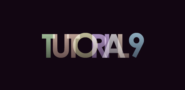
Repeat this process for the remaining letters (each color on a new layer). Try using the same colors more than once every now and then.
Step 6 – Merge
When you’re sure that the type is set correctly, Merge all of your gradient-letters (Select the layers, then Ctrl + E). Then, Merge all of your colors into one layer (Make sure the blending mode is still set to screen).
You should now have two layers – one with the plain gradient layers, the other with the colors for the letters. We didn’t have to do this, it’s just easier to manage.
Step 7 – Getting the Glow
Duplicate your gradient-letters layer (Not the color layer). Apply a Gaussian Blur (See our Filters Tutorial) with value of 1-3 on this layer.
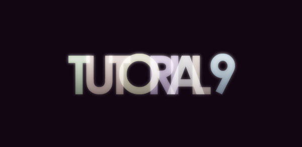
Repeat this step (Duplicate & Blur) on your Color layer. Set this layer to Lighten or Screen (use best judgment). Depending on the saturation and intensity of your colors, you may choose to duplicate the color layer a second time.
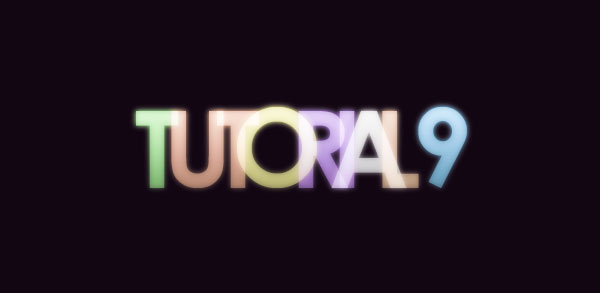
Step 8
Using the Eraser Tool, and a soft brush, go back and erase parts of the colored layers so that the type appears to fade from color to a ghostly white.
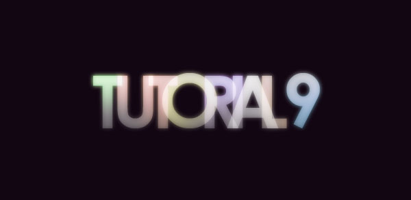
Step 9 – Reflect
Select ALL of the layers being used for the text effect, then Duplicate them. Merge the duplicated version into one layer. Use the trendy Surface Reflection Technique shown in our 5 Essential Reflections for Photoshop Tutorial to mirror your type.
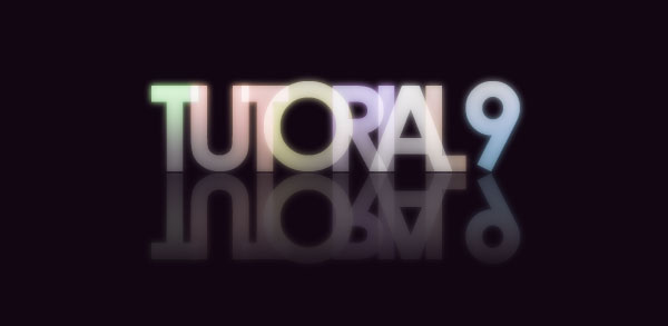
Step 10 – Adjust as Needed!
From here on out, I’ll let you play on your own with the effect. I’d recommend playing with lighting effects in the background — simple things like adding some highlights behind the text… though you certainly could go all out as Drasik does in his work!
Here are some additional steps I took to improve upon the effect:
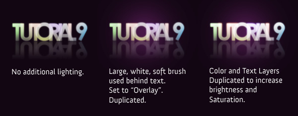
Playing with additional blurs can also add a bit of liveliness to the text. Try Duplicating a layer, and applying a motion blur to see how that works out for you!
Feel free to grab the PSD if you’re having any trouble!
Download the PSD


Hace un tiempo, inspirado por un concurso que plantearon en PSDTuts, me decidí a crear un póster para una película de estilo apocalíptico; y hoy os dejo cómo hacerlo paso a paso. No hay nada nuevo en el tutorial, ningún efecto espectacular, ni nada que te haga pensar que soy un master con el Photoshop; al contrario, todos los efectos son muy sencillos pero, como ves, el resultado es muy bueno.
Como siempre, también tenéis disponible la descarga del tutorial en formato PDF.


 Puedes agregar algunos detalles más, como créditos o el nombre de los actores que protagonizarán la película. Espero que puedas realizar el tutorial sin ningún problema y, para cualquier duda, utiliza los comentarios.


 To help with picking out your shell C4D, here’s a view of only it on a black background:


 Now right click on any of the points (with the pen tool), and click on Make Selection. Press ok, and you should have a selection around the product. Press ⌘-⇧-I (Ctrl+⇧+I) to reverse the selection around the product, and then erase it.

>


 Soft Light; 25 – 35% Opacity
 Luminosity; 90 – 100% OpacityThis should give a nice effect to your image. You should have something that looks a bit darker and more shaded now. Don’t worry about the orange-redish tint; we’ll fix it later.
 After you’re all done, you should have something like this:


Create a Layered Glowing Text Effect

In this tutorial, we will create this effect using very basic Photoshop tools and layering effects. This tutorial is simple enough for a beginner to understand, but I should warn you that in this tutorial there ends up being over 60 active text layers, which will require a heavy use of your computer’s memory. Let’s jump into this tutorial and layer some glowing text.
As always, the layered Photoshop file is available via our Psdtuts+ Plus membership.
As always, the layered Photoshop file is available via our Psdtuts+ Plus membership.
Step 1
Make a new document that is 2000px by 1200px. Then make a new Gradient Adjustment Layer with a linear gradient that goes from a dark gray (#464646) at the bottom to black (#000000) at the top. This will be our background base.

Step 2
Make another linear Gradient Adjustment Layer above the previous one, and make it a rainbow of colors of your choice. There are some colorful presets that you can choose from in the gradient palette, or create your own. Set the layer’s Fill down to 25%. Then set the layer’s blending mode to Color.
Tip: When you set the blending mode to color it makes it so the layer only affects the color of everything below it, while leaving the lightness/darkness alone.

Step 3
Finally make another Gradient Adjustment Layer above the previous two. This one will be a radial gradient. Set this one up so that the only 2 colors in the gradient are black and then make the transparency go from 100% at one end and 0% at the other end.
If you see that black is covering the center of the image, check the Reverse box. Then make it so the black goes around the edges of the canvas. Set the layer opacity to 65%. I moved the transparency handles around a little to get the exact effect that I wanted.

Step 4
Now lets begin with the text treatment. Hit (T) for the type tool, and make a (single click) on the canvas. Then type your letter, in my case a P. Then grab the Move tool and (Hit CMD+T) and transform the letter, adjust it until it’s the size that you want it. Hit (T) again for the type tool, and if it’s not already, make the letter black by clicking the text color box in the property bar. Set the letter layer’s blending mode to Screen. The letter will disappear.

Step 5
(Double click) to the right of the letter layer’s name in the layer palette to bring up the layer styles palette. Put an Outer Glow and a Stroke on the layer with the exact settings that you see below. You will see a very faint image of the letter now.
Let’s use this first letter as a starting point for all the text in the image. Once we layer several different letters on top of each other, our effect will come to life.

Step 6
Duplicate the letter layer by dragging it down to the New Layer button at the bottom of the layer palette. Select the type tool (T) and then change the font on the new layer. If the new font doesn’t line up how you want to hit (CMD+T) to free transform the new letter. Make sure that you always line up the baseline of the letters. You can move the anchor point to the base line when you are transforming to keep it lined up correctly.
Now do this step 20 times, each time using a different font. I chose to use all different fonts that have serifs. You can use all fonts that are sans-serif if you like, but I wouldn’t mix the two.

Step 7
Select all the text layers that you have. Then hit (CMD+G) to group them. With the group selected in the layer palette, hit (V) for the move tool. Then (while holding ALT), click and drag on the letters on the canvas to duplicate them. Drag them to the right where you want the next letter to be. Now there should be 2 groups of text in the layer palette. Turn off all the letter layers in the new group (except the bottom one) by clicking in the little ‘eye’ icon next to each one.
Now select the text tool (T), and highlight the single letter. Then change it to the next letter that you want, in my case an S. Finally, turn the S layer off. Then turn on the next one and do the same. Repeat this until all the letters in your new group are changed. Turn all the layers back on.
Repeat this step for each new letter you need.

Step 8
Select the elliptical marquee tool and make a very thin ellipse at the base of your letters. Then Feather the selection about 20px. Enter quickmask mode (Q). Then go to Filter>Blur>Motion Blur. Make the angle 0 and the length 700px and hit OK. This gives us a nice fade out to the left and right sides. Then exit quickmask mode (Q).
Now make a curves adjustment layer above the gradients, but below the letter groups. Then apply a curve that looks like the one below. This just gives our letters something to sit on.

Step 9
Make a new document that is 300px by 300px. Double click on the background layer to make it an active layer. (Double click) to the right of the layer name to open the layer styles palette. Apply a color overlay to make the layer black. Then add an inner stroke that is white to make a border. You can see my settings below.
Go to Layer>Flatten Image to flatten the image. Hit CMD+A to select all and then go Edit>Define Pattern.

Step 10
Go back to your other document. Make a new blank layer just above your curves layer by hitting the New Layer button at the bottom of the layer palette. Not go to Edit>Fill and select Pattern for the Contents. Then select your black box that should be at the end of the list, and hit OK.
Now Hit (CMD+T) to transform the layer so that it fits in the foreground space. Then (right/control+click) anywhere in the transform box and select perspective. Drag the bottom right handle way out so you get a nice perspective on the pattern layer. Set the layer’s blending mode to screen and the opacity to 15%.

Step 11
There is one last step to add a finishing touch. Select the type layers and duplicate them by dragging them down to the New Layer button. With the new groups selected hit (CMD+T) then (right/control+click) in the transform box and select Flip Vertical. Move them down so they look like a reflection.
With all the reflection groups selected hit (CMD+G) to put them into another group. Set that group’s opacity to 25%. Add a mask to the group by clicking on the Add Layer Mask button at the bottom of the layer palette. With the mask selected hit (G) for the gradient tool and apply a linear gradient from black to white, so the reflection fades out as it goes down to the edge of the image.

Conclusion
This tutorial covered some simple steps and effects to achieve stylish results. The final image is below. If there are any questions, put them in the comments section. I will answer them as soon as I can. I hope you enjoy this tut!
Hace un tiempo, inspirado por un concurso que plantearon en PSDTuts, me decidí a crear un póster para una película de estilo apocalíptico; y hoy os dejo cómo hacerlo paso a paso. No hay nada nuevo en el tutorial, ningún efecto espectacular, ni nada que te haga pensar que soy un master con el Photoshop; al contrario, todos los efectos son muy sencillos pero, como ves, el resultado es muy bueno.
Como siempre, también tenéis disponible la descarga del tutorial en formato PDF.
Paso 1
Abre un nuevo archivo [Archivo>Nuevo o Ctrl+N] de 600×910 píxeles y 300 píxeles/pulgada de resolución.

Paso 2
La imagen que utilizaremos como base del tutorial la puedes descargar desde aquí. Ábrela y copia-pega [Ctrl+C + Ctrl+V] a nuestro lienzo. Tendrás que redimensionarla [Ctrl+T] para ajustarla al tamaño del lienzo. Finalmente, cambia el nombre de la capa (haciendo doble clic sobre el nombre) por Base.

Paso 3
Antes de seguir, crearemos nuestro primer grupo para tener todas las capas ordenadas. Para ello, haz clic en el icono en forma de carpeta  que verás en la parte inferior de la Ventana de Capas. Una vez creado el grupo, duplica [Ctrl+J] la Capa Base y asegúrate de que está dentro de la carpeta (de no ser así, arrástrala dentro).
Selecciona la Herramienta Tampón de Clonar [S] y elimina algunos detalles de la capa duplicada, como algunas personas, parte de la publicidad, etc. (fíjate en la imagen para ver los cambios y no te preocupes por las imperfecciones que puedan quedar, más adelante se solucionará). Hecho esto, puedes modificar los niveles [Ctrl+L], arrastrando la barra del medio hacia la derecha, para oscurecer un poco la imagen.


Paso 4
Duplica la Capa Base Copia y, con la nueva capa activa, presiona [Ctrl+Shift+Delete o ve a Edición>Rellenar] y rellena la capa con un color negro. Cambia el Modo de Fusión de la capa a Color y su opacidad al 60%.

Paso 5
Crea una nueva capa [Ctrl+Shit+N] y selecciona un pincel [B] de color negro. Con el modo de fusión de capa en Oscurecer y la opacidad al 83%, pinta sobre el cielo y los edificios que más reflejos desprenden, para darle un toque más oscuro (recuerda que va a inundarse la ciudad xD). Aunque después “taparemos” el cielo, la oscuridad que le demos a los edificios en este paso seguirá presente.

Al tener todas las capas que hemos creado hasta el momento activas, podrás ver que el aspecto que le ha quedado al cielo no es para nada bueno, así que vamos a ponerle otro (descárgalo desde aquí)…con más nubes, que alguien crea que puede llover xD
Una vez que hayamos abierto la imagen y la tengamos pegada en una nueva capa de nuestro documento (siempre dentro del grupo que hemos creado al principio) la puedes redimensionar [Ctrl+T] para ajustarla a la parte de la imagen donde debe ir y, después, aplica una máscara de capa  . Para eliminar las partes de la imagen que no necesites (sólo debe ocupar la parte del cielo), utiliza un pincel negro.

Paso 6
Si te fijas en la parte derecha de la imagen, queda un trozo de una pancarta de publicidad sin tapar. Lo hubiéramos podido hacer en los primeros pasos, pero no pasa nada, es sencillo: selecciona, por ejemplo, con la Herramienta Lazo [L], un trozo de la pared que arriba está despejada y pégalo en una nueva capa [Ctrl+N]. Si quieres conservar las señales que hay en la pared, tan solo tendrás que eliminar un poco de la pared para que se vean las señales, sino, recuerda despejar también las señales de la pared de arriba, ya sea copiando y pegando de nuevo la pared, o simplemente con la Herramienta Tampón de Clonar [S].

Paso 7
Llegados a este punto, inundaremos la calle  Descarga desde aquí la imagen y copia-pégala en nuestro trabajo. Una vez redimensionada [Ctrl+T], acóplala a la zona adecuada y añade, de nuevo, una máscara de capa para eliminar (pincel negro), o “regenerar” (pincel blanco) todas las partes de la imagen, hasta que estés satisfecho con el resultado.

Paso 8
Vamos a ponerle un poco de dramatismo al asunto; le añadiremos dos entradas de agua, una a cada lado. Para ello, abre esta imagen y pegála en nuestro trabajo. Deberás tener dos copias, así que duplica la capa.
Como cada entrada de agua sale de una parte diferente (derecha e izquierda), a una de las dos capas tendrás que voltearla horizontalmente [Edición>Transformar>Voltear horizontal]. Después solo te queda repetir los pasos que has hecho hasta ahora: redimensionar [Ctrl+T] las imágenes hasta colocarlas en su sitio y añadir máscaras de capa a cada una para remover las partes no deseadas.

Antes de seguir con el siguiente paso, vamos a organizarnos un poco. Todas las capas que hemos creado (excepto la capa Fondo y la capa Base) deberían estar dentro del Grupo 1. De esta forma, nuestra paleta de capas tendrá que estar así: Fondo, Base y Grupo 1 (y, ya dentro de la carpeta, todas las capas que hemos creado hasta ahora). Sigamos.
Paso 9
Duplicamos el Grupo 1 (clic derecho encima del grupo y seleccionas Duplicar conjunto de capas). Hecho esto presiona Ctrl+E para combinar el conjunto de capas. Como ves, ahora tendrás en una sola capa todo lo que tenías metido en el grupo (puedes renombrar esta capa, por ejemplo, como “Inundación” ). Ya puedes desactivar la visibilidad del Grupo 1 (haciendo clic en el icono en forma del ojo al lado del grupo).
Ahora aplicaremos una textura. Realmente, esta capa es una mezcla de filtros que apliqué en su momento pero, como ya hace un tiempo que lo hice, no recuerdo cuáles son exactamente. No hay problema, puedes descargarlo como una textura desde aquí.
Pégala en nuestro trabajo, encima de la capa Inundación y cambia su modo de fusión a Multiplicar y su opacidad a 26%. Mete estas dos capas en un nuevo grupo (Grupo 2) y, tal y como has hecho antes, combina las capas del grupo y desactiva la visibilidad de Grupo 2, quedándote solo con la nueva capa creada.

Llegados aquí tendremos la siguiente situación en la ventana de capas: Fondo, Base, Grupo 1 y Grupo 2 (ambos con la visibilidad desactivada) y la nueva capa que contiene todo lo hecho anteriormente. Un poco más.
Paso 10
Duplica la capa y utiliza la Herramienta Esponja [O] para desaturar levemente las fachadas de nuestra imagen.

Ahora crearemos una nueva capa y añadiremos unos pequeños detalles a la inundación que tenemos en el plano de fondo. Para ello selecciona la anterior capa (la que contiene todo el trabajo) y, con la Herramienta Tampón de Clonar [S], con una opacidad media, selecciona [Alt+clic] alguna zona de las entradas de agua que contenga “espuma”. Sitúate después de nuevo en la nueva capa y ve clonando, poco a poco, algo de espuma, para darle un aspecto más realista.

Paso 11
Casi terminamos. Ahora crearemos un efecto de lluvia, y es algo muy sencillo. Crea una nueva capa (puedes renombrarla como Lluvia para no hacerte un lío) y, rellénala [Shift+Delete] de negro; después ve a Filtro>Ruido>Añadir ruido (aquí pon la cantidad que quieras; juega con diferentes valores hasta conseguir el efecto que más te guste, pero la distribución tiene que ser Gaussiana y Monocromática );y, por último, aplícale un Filtro>Desenfoque>Desenfoque de Movimiento (de nuevo, aquí ponle los valores que más le convengan al efecto que busques).
Opcionalmente, puedes crear una segunda capa de lluvia, esta vez con mayor distancia en el Desenfoque de Movimiento , para conseguir un mejor efecto.

Ahora tendrás que meter todas las capas que hemos trabajado en un nuevo grupo -Grupo 3- y, como has hecho antes, convertirlo en una sola capa y desactivar la visibilidad de Grupo 3, quedándote solo con la nueva capa.
Paso 12
Duplica la capa que ha resultado de combinar Grupo 3. Hecho esto selecciona la Herramienta Texto [T] y escribe lo que será el título de nuestra película: New Dawn (algo así como Nuevo Amanecer). Los efectos de texto que he aplicado son estos:


Después de aplicar los efectos, duplica la capa de texto. Duplícala una segunda vez (ahora deberías tener 3 capas de texto), borra el estilo de capa anterior (clic derecho en la capa y Borrar estilo de capa ) y ahora aplícale un Resplandor Exterior [color #DFDFDF]. La opacidad de esta capa de texto deberá ser de un 28%.

Sólo una más  Vuelve a duplicar la capa, borra los estilos y rasterízala [Capa>Rasterizar>Texto]. Selecciona el contenido de la capa resultando (haciendo Ctrl+clic en la miniatura de la capa) y rellénalo [Shift+Delete] de color blanco. Baja la opacidad de la capa al 80%.

Paso 13
Para terminar, agregaremos algunos detalles más. Selecciona de nuevo la Herramienta de Texto [T] y escribe un lema/subtítulo para la película: Extinction is not an option. La fuente que he utilizado yo aquí es una BankGothic Md BT, sin ningún efecto.
Penúltimo arreglo: un Coming soon (Próximamante)  con el mismo tipo de letra que el lema de la película, pero con un pequeño efecto.

Y ahora si, el último: añade una nueva capa de ajuste  (que se aplicará a todo el trabajo) de Curvas.

Conclusión
Hecho. Fotomontaje terminado
Let’s see the final product:

Let’s get Started with Step 1:
Open up photoshop and bring out your canvas. You’ll want a lot of space to work with, so don’t be shy to start with a fairly large canvas. Each project will differ, so you’ll need to be the judge on the amount of space you want (I went with a 940 x 710 canvas).
Pic a solid color for your background, and used the bucket tool (quick-key: ‘G’) to fill it in. If you want lighting to show, try picking a dark color, as it will be much easier to show it than in bright backgrounds. For this piece, we will choose the color black

Step 2:
Now grab a fancy brush set, and use it to create a vector/pen-tool like effects around the center of the canvas. If you don’t know how to install brushes, read the next section at of this tutorial to get some help with that you that. If not, just skip to the next part.
Installing Brushes:
After you download the brush set (it should come in either a .abr file, or a .zip. If it’s a zip, unzip it to be able to get to the .abr file).
After you have that ready, go back to photoshop, and select the brush tool (quick key: ‘B’). Click on the drop down menu for the brushes in the top bar:

Now click on this button ( ) on the top right corner, and go down to load brushes. Select the brush set you want (the .abr file), and click ok. The brushes from that set should now be found at the end of you current brushes, and ready to be used!
Step 2 (Continued…):
As for brush sets, the one I used can be found here: http://axeraider70.deviantart.com/art/Winter-Breeze-Brushes-44617350, and full credit goes to the maker of the set.
If you are familiar with the Pen-tool, however, draw a few line shapes flowing outward from the center of the canvas, as well as some small circles spread throughout. You will want a similar effect as shown below:

As for what color to use, again, it depends on what you want your final product to look like. If you want something fiery and exciting, use warm colors (red, orange, yellow, etc…); if you want something more cool and sophisticated, pick colder colors (blue, green, purple, for example). You will have to keep these decisions in mind throughout the tutorial, but make sure you stick to a certain type.
After you have your layer of the vector shape, you will want to duplicated it (right click on the layer > duplicate), and flip it horizontally. One way to do this is to press Ctrl/⌘+T while editing the layer you want to flip, then right click and choose Flip Horizontally. Make sure it centers nicely, as shown below:

Step 3:
Now we’re going to be playing around with a few brush settings. Get out the default &ldquot;Soft Round 9 pixels&rdquot; brush (it comes pre-installed with photoshop), then open up the brush settings. Now use the following settings on your brush:


Brush around a bit in your canvas until you get a suitable effect. You’ll want this to cover a good area of where you’ll be working. Also, make sure to brush in the color white. Leave this layer in Normal, and set the opacity to around 85%

Step 4:
To start out our techy look, grab the pentool, and draw some shapes that come out of the center of the image and are a techie shape. This can be hard to do with the pentool/default brushes alone, so downloading a brush back is recommended. You can utilize whichever one you prefer, but for reference, I used these in my artwork: http://wizard-studios.deviantart.com/art/Technetronic-Brush-Set-40742521. Use a soft brush eraser to erase around the edges of some parts:

Step 5:
Before we start the next part, we’ll have to go over a new type of outside tool that can be used in graphics for photoshop: C4D renders.
If you know about these, and know how to use them, then you can skip this paragraph. If not, follow along my friends.
C4D is a 3D render program that allows people to create virtual images in very detailed 3D. The most common use of this program is for models, but some people also make these renders to be used in photoshop, to add an amazing effect to a piece of art. There are two main types of C4Ds we will be dealing with: Effect C4Ds, and Render C4Ds. Effect C4Ds are used for lighting, and they’re just mainly glows and reflections.
An example can be found here: http://ess3nce.deviantart.com/art/C4D-Effect-Render-4-35285672. Render C4Ds, on the other hand, are abstract renders used to implement a particular art work with extra effects.
Another example can be seen here as well: http://drugi.deviantart.com/art/Underwater-c4d-54685612. Again, all credit goes to the creators of the individual art works. I won’t be able to tell you exactly which ones to use, as it is impossible to recycle C4Ds for every need. The best places to find them, however, are http://www.deviantart.com/, http://planetrenders.net/, and sometimes even google.
All the C4Ds I used can be seen in the .psd file provided along with the tutorial, so if you wish to use them, or want to see what they look like, just check the layers.
Now to move onto actually using these. Find a nice and flowy Render C4D, and make sure it is in a bright color. You’ll want it to flow along with the direction of the previously drawn red Pentool shapes. Resize it, and erase parts of it that don’t fit, to get something like this:

Just as it was done with the red Pentool, flip it horizontally and place it to that it flows nicely off the middle of the canvas:

Step 6:
Now it’s time to grab another c4d. Pick one that flows nicely with the image, and has a color you want for the final product. Make sure it’s a compact one, and doesn’t have too many parts flowing out of it. Place it in the center of the image, then set the blending mode of the layer to Lighten. To change blending modes of layers, there is a drop down bar in the layers window:

The just go down the the layer mode you need, and select it. This will be a technique used throughout the tutorial, so make sure to remember how to do it. Next, go Filters > Distort > Ocean Ripple, and use these settings on it:

As always, erase what you don’t like with a soft brush, and the result should come out something like this:

Step 7:
You guessed it: it’s time for another C4D. However, this is an important one, so much sure you chose it wisely. You’re going to want one that sort of acts like a case for your product. We’re going to be placing the iPhone on the center of the canvas, so the &ldquot;shell&rdquot; C4D must appear to sort of circle around the product. It’s hard to explain, but if you look at the .psd file and the image below, you will see what I mean.
If any part of this C4D is going to be erased, you should use a Hard brush instead of the Soft brushes we’ve been generally using.
Once you have your C4D picked out, place it properly in the canvas, while trying to envision where your product will be placed. You should have something like this:


Step 8:
It may no seem like we have much now, but it’s all about to come together soon. This is the important step where you will place your product. To prepare the product, first take a nice picture of it on a plain background.
After you open this in a different file, first thing you should do is right click on the only layer (should be labelled background), and go to Layer from Background. Click Ok, and you will now be able to use transparency in your picture. Grab the crop tool (C), and make a selection around the picture you want to use. After you’ve selected, simply right click and go to crop. You should have the area around your product now

Now, if your picture is in a plain background, you may be able to get away with just using the magic wand tool (W). Play around with the Tolerance (the more tolerance, the more of different colors similar to the one you picked it will select. After your selection is done, erase it. You should now have an image of your product on a transparent background now. If your image is not just a plain colored background you can erase, you’ll have to use the pen tool. Grab it, and then make points around the product to select only it. Make sure you hold down shift and click and time you want to make straight lines, and hold down and drag after making the point to make curves. A finished path should look like this:


>

Now place your product into your image. Try to get it as centered as possible, so that the product will be the center of the ad.

Now, remember the shell C4D discussed above? Well this is where it comes in. With a very small soft brush eraser (make sure you’re zoomed in), erase certain parts of your product that the shell C4D goes over. This will give your ad a much more dynamic view and effect. It may help to lower the opacity of the product layer so that you can see which spots overlap. After erasing the parts you want, you should have something like this:

An alternate method is to simply duplicate the C4D shell layer, and bring the copy layer above the iPhone. Now just erase the parts you DON’T want. Some people find this much easier to do, so it’s up to you
Step 9:
You can see that it looks a lot more professional now, doesn’t it? However, we’re not done yet. It’s time to spice it up and give it some flavor! Grab your pentool, and use it to make some shapes around your product. These shapes will be colored in black, and will be used to settle down the crowded look of the piece. Your shapes should look something like this:

After making some of these around one side, just simply flip them horizontally and place them symmetrically on the other side as well. As always, replacing the pentooling with brushes is also a good idea

Step 10:
Now we’re going to be adding some lighting and some more vector shapes around the product. Grab a 200 px soft brush, and pick a light cold color. I personally used a light shade of purple. Put the opacity of the brush down to around 40-50%. Brush softly around the bottom area of the product, as such:

Put this layer blending on Color Dodge, and play around with the opacity until it looks good.

Step 11:
Time to bring out your trusty pentool out again. Much like the pentool layer in black, we’re going to make another two sets (or more if you want to add to your piece). Use solid bright colors on these. You’ll also notice I played with the opacity of some of the shapes as well, so give it a more dynamic look. As always, brush sets work fine as well. Also, remember to use symmetry (copy the stuff you made on one side to the other). These are the two sets of shapes I made:


You can use a large soft brush to erase if you want as well.
Step 12:
Time to add some gradient maps to our image. To do this, click on the  button on the bottom of the layers window, then click on Gradient Map. We’ll be adding two maps in this part. They are as follows:
 Soft Light; 25 – 35% Opacity
 Luminosity; 90 – 100% Opacity
Step 13:
Grab a large (around 200px) soft brush, and pick about 2 – 3 light colors, and 1 – 2 darker ones. We’ll be adding points of lighting around the image now. If there was a step that the .psd file really helps with, it’s this one, so make sure to check it out if you’re having any problems. You want to make some brushing around corner and side areas of the product. Here’s a couple of examples:


Change all these lighting layers to Linear Dodge (Add) blending mode, and play around with their opacity until they each look good and fit. Your result should be:

Step 14:
This step is optional, but can really help out with the look of your outcome. Find two C4Ds that are the same style as the shell C4D we used before. Place them in the corners of your product where you didn’t add lighting. Resize these to a fairly small size, and set them to a blending mode of screen:

Step 15:
Add another one of those Black & White gradient maps we added above, except leave it at 45 – 55% opacity in luminosity. Next, add a color balance layer (you can do this the same way as adding Gradient Maps). Make the more prominent colors in your piece more heavy oriented using the bars. For example, green and cyan are the colors we want this piece to represent, so the settings below were used:

Now is also the time to add any other pentooling or shaping you would like to, since the piece is nearing completion. After you are all done, you should have something like this:

Step 16:
Make a new layer, and go to Image > Apply Image. In this new layer, click Filter > Blue > Gaussian Blur. Set this layer to Color Dodge, and 70 – 80% opacity. Erase all the parts that don’t look good/are too strong, and come out with a result like this:

Step 17:
Here’s the part where you add text. You may want to do so, you may not, it’s up to you. This tutorial isn’t really meant to convey advanced text techniques (that is for another day!). So for the sake of simplicity, we will add some simple text. You can look at the .psd to see how the text was done. Either way, make a new layer, and grab a soft black brush (or whichever other color you chose as a background). Brush around this new layer to ‘erase’ parts you don’t like about the piece. This is an important step to cleaning up the overall product. This is what I came out with at the end:

Step 18:
Now it’s time to make a reflection. Apply the image to another layer, and flip it vertically the same way that you flipped the image horizontally a couple of steps back. Set this image in a position when a reflection would be believable. Set this layer to screen at around 15 – 20% opacity, and you should have this:

Apply a Gaussian blur of around .3 on it, then erase most of it with a soft brush, set to around 60% opacity. This is just for extra effect, not a real reflection (for real reflections to work nicely, there’s a lot of steps involved which won’t be covered here). Your end result should be this:

Final Step:
One last thing we must do. Apply image again, then go Filter > Sharpen > Sharpen. Leave this layer on normal, and change the opacity of it until it looks good. Also, use a soft brush to erase parts that you don’t want sharpen. This will add the final touch to the product, so make sure to take your time. Add anything else you want along with the image, and we are done!Final Piece:



.jpg)

